Kris Kras Design
Branding and stationery
Kris Kras is a full-service communication and design agency in the heart of Utrecht and has been around for more than 35 years. They work for high level government and business clients. They develop communication concepts and the associated online and offline resources.
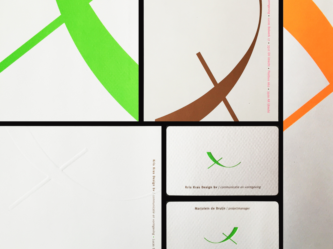


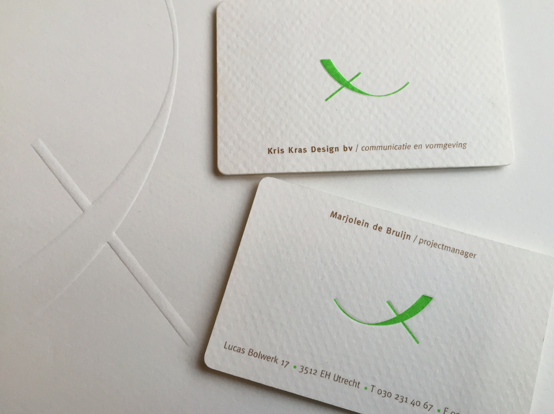
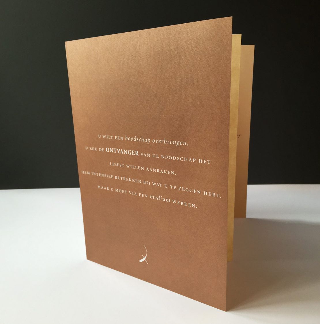
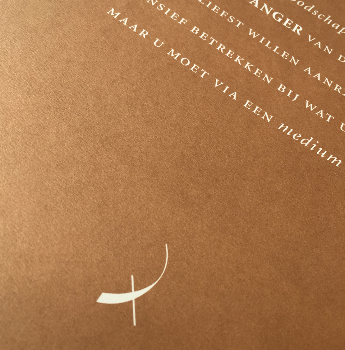
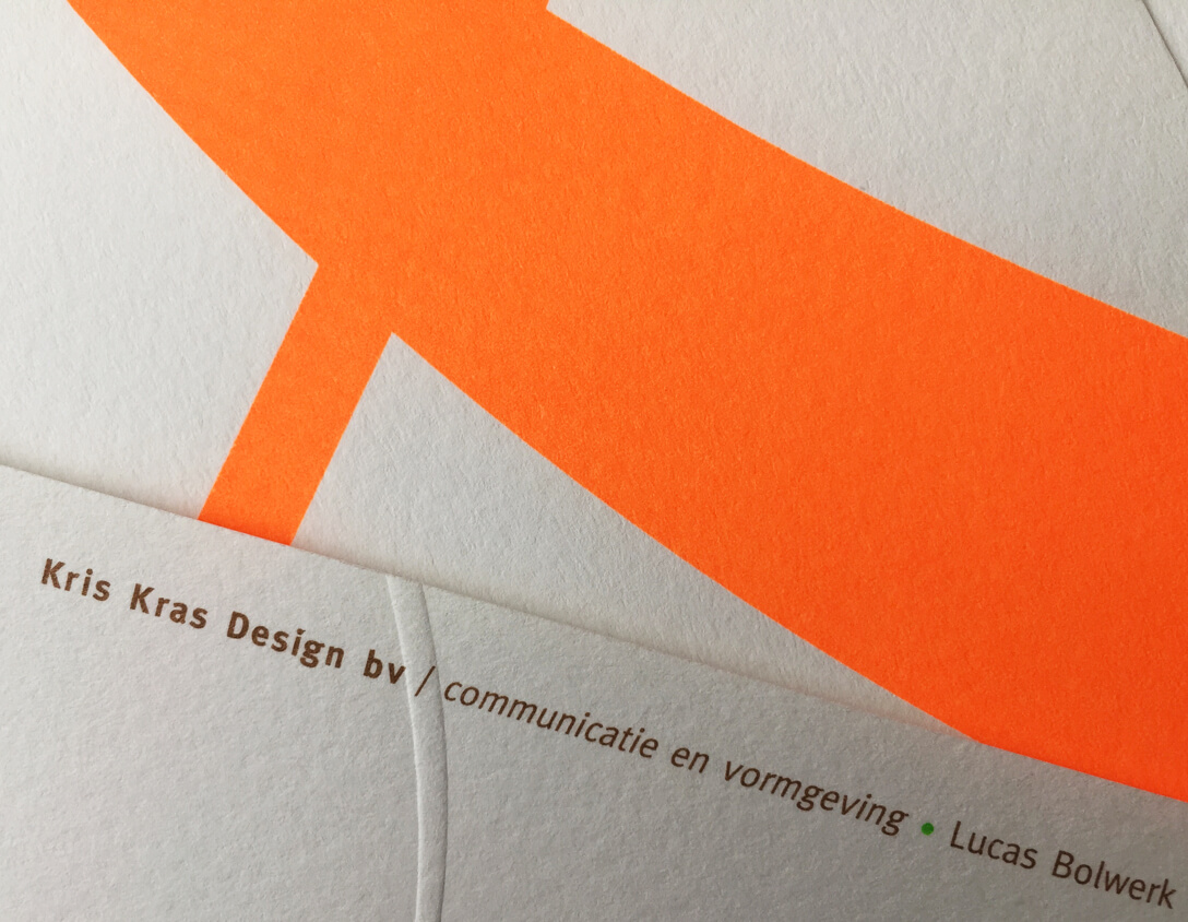
I was asked to design a new corporate identity for their studio in Utrecht. The symbol I created to represent their company suggests the letter K for the name of the company. This combines both a uniform and a more fluid component, representing all aspects within the structure of the company. Working with a strong colour palette of bonze, green and orange, I used beautiful paper stocks and print techniques such as embossing and luminous spot inks to create a contemporary and memorable brand image.
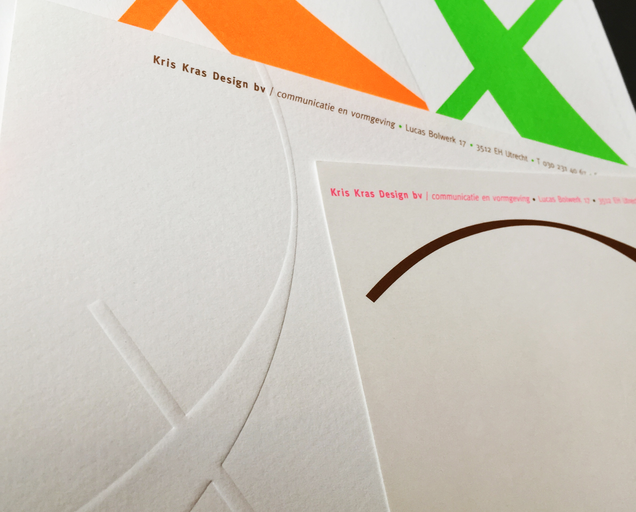
A full stationery suite was developed along with a Z-fold company brochure. This was printed using a bronze metallic ink, giving a luxurious look and feel. Metallic inks work best when used in large areas of colour, you can really see their shine and reflective properties. For this reason I chose not to print text with the metallic ink, but instead to use large areas of a metallic colour and knockout the text from it.